Introduction
In this blog post, we will enhance our app's theme to use dynamic colors taken from Material 3's OS-defined color scheme.
In Android 12, Material You, the third iteration of Material Design was introduced. One of the main features of Material 3 is Dynamic Color, which allows users to select their own color scheme for the whole OS, derived from the wallpaper.
This results in a set of primary, secondary and tertiary colors being consistent across the whole OS as well as built-in apps such as the clock, calculator, and even some Google apps such as Photos.
You may not always want implement this for your apps, especially if your app needs to follow specific brand guidelines (and if color is an important part of your brand). However, in some cases, supporting a dynamic color theme might make sense, depending on your app and brand.
In this post, we will enhance the default Flutter counter app with dynamic color, using the dynamic_color Flutter package provided by the Material team.
Using Material 3
For this tutorial, we will be working with the basic Flutter counter app example, but with one small change. We will change the provided theme from the below:
ThemeData(
    primarySwatch: Colors.blue,
)
To this:
ThemeData(
    colorScheme: ColorScheme.fromSwatch(primarySwatch: Colors.blue),
    useMaterial3: true,
)
We do this in order to enable Material 3 using the useMaterial3 flag. Not all widgets in Flutter are "Material 3-ready" as of yet, so we need to enable this explicitly.
We replace primarySwatch with colorScheme, but these actually do the same thing. However, colorScheme is now actually the preferred way to configure colors. We also do this because we will use colorScheme for the dynamic color.
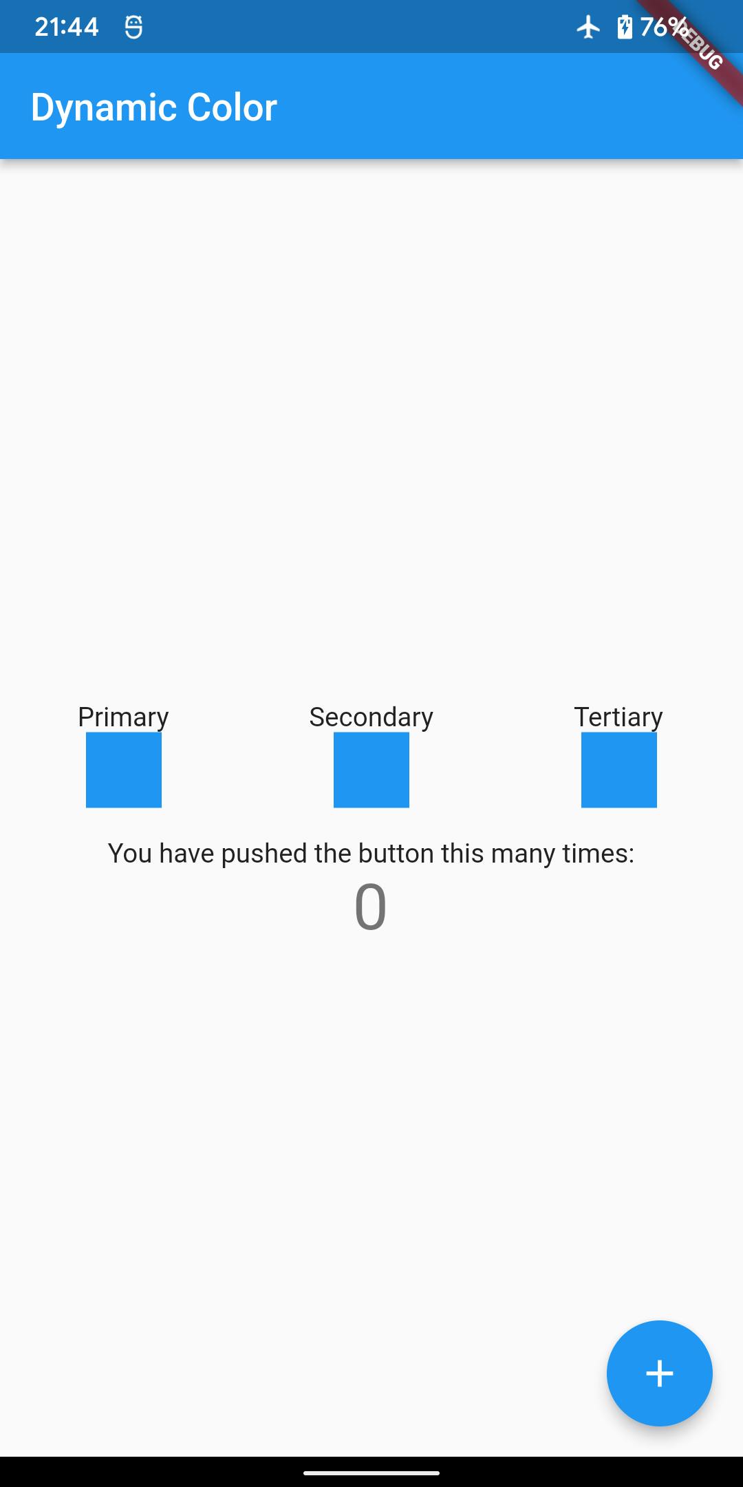
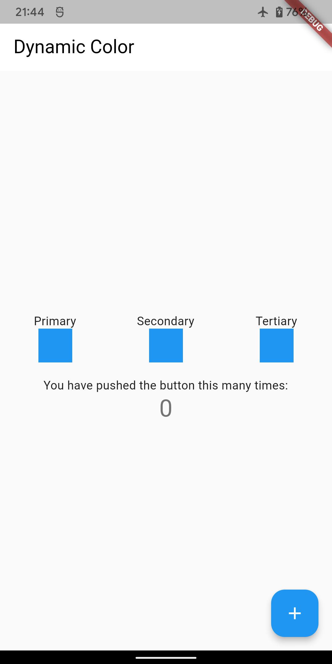
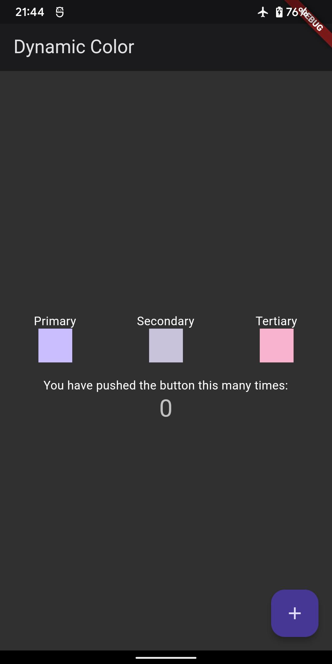
We've also added three boxes showing the color scheme's primary, secondary and tertiary colors. This is so we can compare and see what happens to the color scheme once we've implemented dynamic color.
Here is how our app looks before and after this, if you're curious.
|
|
Using dynamic color
The dynamic_color package
The Material team has already created a package to help with this. It returns a Material color scheme based on a platform's implementation of dynamic color. This is actually not specific to just Material 3 and Android!
From the package's GitHub repo page, here is what you get from each platform:
- Android (12 and up) - color from the wallpaper
- Linux - GTK+ theme's
@theme_selected_bg_color - macOS - app accent color
- Windows - accent color or window/glass color
Let's install the package:
flutter pub add dynamic_color
Alternatively, add this to your pubspec.yaml:
dependencies:
  dynamic_color: ^1.4.0
The DynamicColorBuilder widget
Let's now make use of the dynamic_color package to actually use dynamic colors. We can do this with the DynamicColorBuilder, a builder widget that uses a plugin under the hood to fetch the dynamic color from the OS and returns a light and dark color scheme.
DynamicColorBuilder({
    Key? key,
    required this.builder,
})
DynamicColorBuilder accepts an optional key and requires a builder which should return whatever widget we want to enhance with dynamic colors. The builder widget's signature looks like this:
Widget Function(
    ColorScheme? lightDynamic,
    ColorScheme? darkDynamic,
)
We can return a widget, any widget, and the builder includes a light dynamic color scheme as well as a dark dynamic color scheme. Both color schemes are nullable; if the OS does not respond or the platform does not support dynamic color (like with older Android versions), it returns null.
Using dynamic color schemes
We now have the dynamic_color package installed, and know how the DynamicColorBuilder widget works. Let's use it to make use of the system's color scheme.
Here's what the build method of our root MyApp widget looks like now:
@override
Widget build(BuildContext context) {
  return DynamicColorBuilder(builder: (lightColorScheme, darkColorScheme) {
    return MaterialApp(
      title: 'Flutter Demo',
      theme: ThemeData(
        colorScheme: lightColorScheme ?? _defaultLightColorScheme,
        useMaterial3: true,
      ),
      darkTheme: ThemeData(
        colorScheme: darkColorScheme ?? _defaultDarkColorScheme,
        useMaterial3: true,
      ),
      themeMode: ThemeMode.dark,
      home: const MyHomePage(title: 'Flutter Demo Home Page'),
    );
  });
}
We've wrapped the MaterialApp widget with DynamicColorBuilder. For the theme, we replaced the previous colorScheme with the light color scheme provided by the builder. We also provided a darkTheme in addition to theme, which uses the dark color scheme provided by the builder. Note that since both color schemes are nullable, we have default color schemes, which we've extracted to static constants.
static final _defaultLightColorScheme =
    ColorScheme.fromSwatch(primarySwatch: Colors.blue);

static final _defaultDarkColorScheme = ColorScheme.fromSwatch(
    primarySwatch: Colors.blue, brightness: Brightness.dark);
These are exactly what we had before, with additionally the dark color scheme which we define in exactly the same way, plus the dark brightness value.
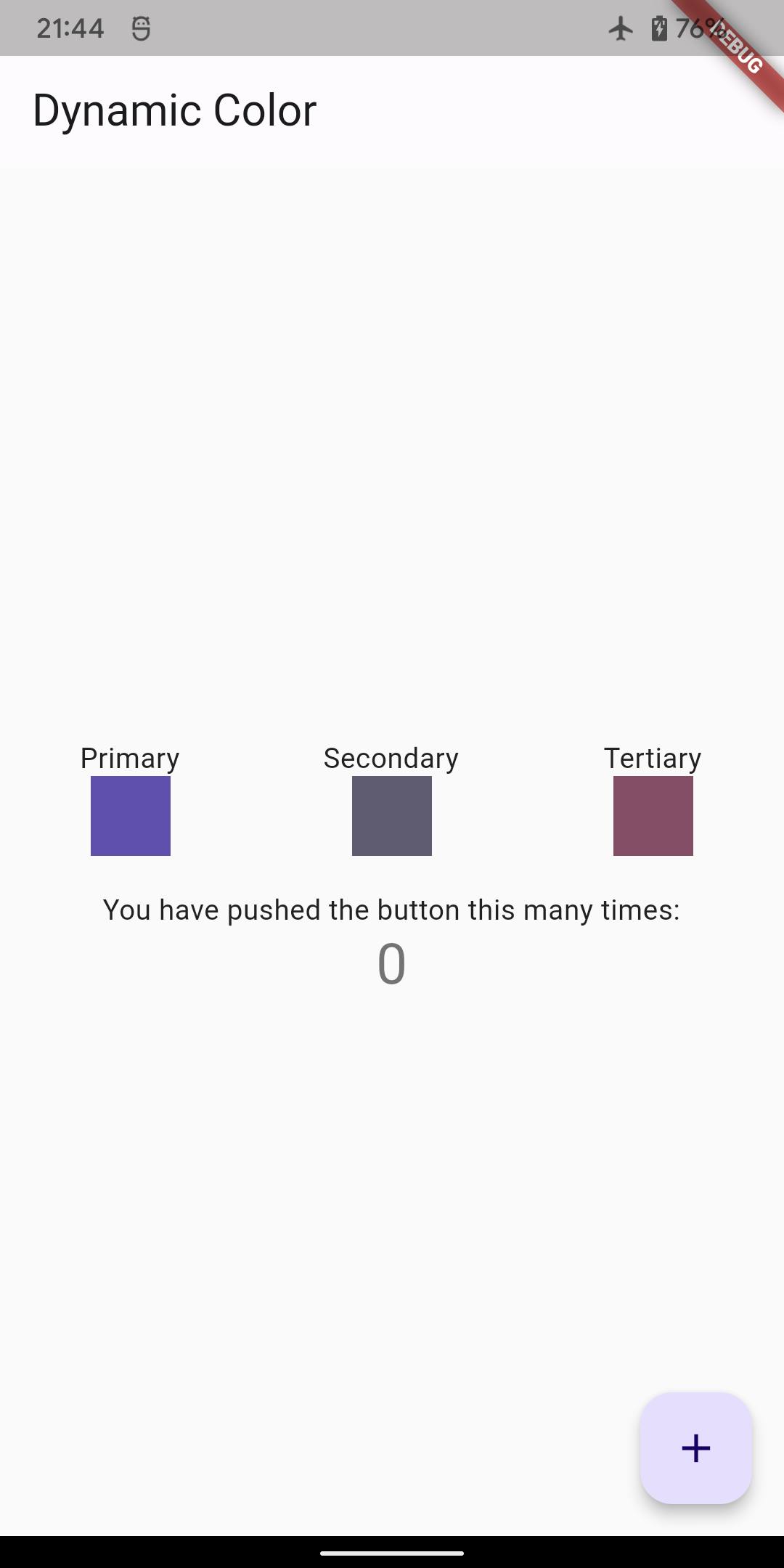
And that's it! With just a trivial amount of lines of code added (less than 10 if you don't count the default color schemes), we have a theme with a color scheme which dynamically changes depending on your operating system's settings. Here's how it looks like now:
|
|
A small note if you're implementing this for your app. In debug mode, when the app loads for the first time you may quickly see the app load with the default color scheme for a split second before refreshing with the dynamic color scheme. Not to worry though, this won't be the case for your production app!
Wrapping up
In this tutorial, we showed how to implement dynamic color in themes in our Flutter app, to make use of the Material 3, or You, dynamic color feature available in Android 12.
You can find the full source code here.
If you found this helpful and would like to be notified of any future tutorials, please sign up with your email below.

