Implementing True Black dark theme mode in Flutter

Introduction
If you've been using Flutter for a while, you already know theming with Flutter is very easy, and switching between light and dark mode is available out-of-the-box, something which can be a pain to implement with other frameworks if you don't build your app with this in mind.
But what if light and dark mode is not enough for you? What if you want to implement a "true black", "true dark", "lights out" or "OLED dark mode", or whatever the proper name for this extra mode is...?
This is not trivial to do, but if you really wanted, you could configure ThemeData to have darker colors and use the "true" black color (Color(0xFF000000), or Colors.black in the material library). Theming in Flutter is easy, after all!
But there's a simpler, even easier way to implement this mode. Enter flex_color_scheme.
The flex_color_scheme package
flex_color_scheme is a package that allows you to easily build color scheme based Flutter themes. It has lots of beautiful built-in themes available, but you can also easily create your own by specifying a primary color and an optional secondary color. With this package, enabling "true black" mode is as simple as setting a value to true.
Installing the package
Run this in your terminal to install the package:
flutter pub add flex_color_scheme
Or just add the dependency in pubspec.yaml:
dependencies:
  flex_color_scheme: ^4.1.1
As of the time of writing of this post, the current version is 4.1.1.
Using the package
Now, let's set up a theme with flex_color_scheme. For this tutorial, I'll be using the default Flutter counter starter app.
Let's apply a new theme by updating the main build method:
@override
Widget build(BuildContext context) {
  return MaterialApp(
    title: 'Theming Tutorial',
    theme: FlexThemeData.light(scheme: FlexScheme.hippieBlue),
    darkTheme: FlexThemeData.dark(scheme: FlexScheme.hippieBlue),
    themeMode: ThemeMode.dark,
    home: const MyHomePage(),
  );
}
I'm a fan of the built-in Hippie Blue scheme, so I'll be using that one. FlexThemeData provides convenience extensions to return a ThemeData object given a scheme or colors.
You can specify your own colors which will override the scheme colors by using the FlexSchemeColor#of constructor and specifying a primary and an optional secondary color. The default scheme is FlexScheme.material.
FlexThemeData.light(colors: FlexSchemeColor.from(primary: Colors.blue, secondary: Colors.green))
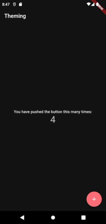
Below is what our app looks like right now. Strangely, there is no blue in "hippie blue" dark mode! This is because, though the app bar is actually blue (primary color) in light mode, it's black in dark mode, as per the Material guidelines.

True black mode
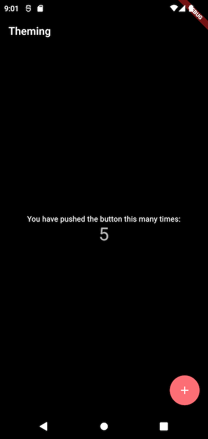
Switching from dark mode to true black mode is easy. Simply set the darkIsTrueBlack in your flex theme data to true.
darkTheme: FlexThemeData.dark(
  scheme: FlexScheme.hippieBlue,
  darkIsTrueBlack: true,
),
Save your change, watch your app hot-reload, and... ta-da! Dark mode is now true black. On OLED screens, this can also preserve battery.

What does this flag actually do? It sets the scaffold background to black, as well as making other surfaces 8% darker.
Note: the darkIsTrueBlack flag is only available in FlexThemeData#dark. There is a lightIsTrueWhite equivalent in FlexThemeData#light, but is not as useful. Similarly to the dark flag, it sets the scaffold background to white, and other surfaces 8% lighter.
Supporting both dark and true black mode
So far, we've shown how to easily set up "true black" mode in our Flutter app. If that's all you're here for, feel free to skip this and jump to the conclusion!
But what if you'd like to support both "regular" dark mode, as well as "true black"? If your app has plenty of users, surely there will be preferences for both. Some users might find "true black" too dark, while others will want to take advantage of their device's OLED screen and use true black.
To support theme changing in the app, it's time to manage some state!
Switching between light and dark theme mode
Before adding this third theme option, we should note that there is an additional theme mode: ThemeMode.system. This will use the user's system theme: it may be light or dark. To get started, let's implement the option to switch between these 3 theme modes (light, dark, and system) in our app.
To implement this, I will use a ValueNotifier, along with a ValueListenableBuilder, just to keep things simple. You could instead do this with e.g. a ThemeController with the ChangeNotifier mixin, which could additionally store the user's selection to local storage (e.g. shared_preferences). Or, you could use a state management package of your choice. But this is outside the scope of this tutorial!
This is what our root widget looks like now:
void main() {
  // This could be loaded from storage e.g. with `shared_preferences`
  const themeMode = ThemeMode.system;
  runApp(MyApp(theme: themeMode));
}

class MyApp extends StatelessWidget {
  MyApp({Key? key, required ThemeMode theme})
      : _themeNotifier = ValueNotifier(theme),
        super(key: key);

  final ValueNotifier<ThemeMode> _themeNotifier;

  @override
  Widget build(BuildContext context) {
    return ValueListenableBuilder<ThemeMode>(
      valueListenable: _themeNotifier,
      child: MyHomePage(onThemeUpdate: onThemeUpdate),
      builder: (context, theme, child) {
        return MaterialApp(
          title: 'Theming Tutorial',
          theme: FlexThemeData.light(scheme: FlexScheme.hippieBlue),
          darkTheme: FlexThemeData.dark(
            scheme: FlexScheme.hippieBlue,
            darkIsTrueBlack: true,
          ),
          themeMode: theme,
          home: child,
        );
      },
    );
  }

  void onThemeUpdate(ThemeMode themeMode) {
    _themeNotifier.value = themeMode;
  }
}
We wrapped our MaterialApp with a ValueListenableBuilder. The value listenable of this builder is a ValueNotifier, initialized with the theme mode we passed when creating the root widget.
Every time we want to change the theme, we will change the value of _themeNotifier, which will trigger the builder and rebuild our MaterialApp widget.
Notice that we're now passing the function that will change the notifier's value down to the home page widget. Whenever we want to change the theme, we can use this function.
To change the theme, let's add a new action in the app bar.
return Scaffold(
  appBar: AppBar(
    title: Text(widget.title),
    actions: [
      IconButton(
        onPressed: _selectTheme,
        icon: const Icon(Icons.brightness_4_outlined),
      )
    ],
  ),
  ...
);

Future<void> _selectTheme() async {
  final theme = await _showThemePicker();
  if (theme != null) {
    widget.onThemeUpdate(theme);
  }
}

Future<ThemeMode?> _showThemePicker() {
  return showModalBottomSheet<ThemeMode>(
    context: context,
    builder: (context) {
      return SafeArea(
        child: Column(
          mainAxisSize: MainAxisSize.min,
          children: [
            ListTile(
              title: const Text('Light'),
              leading: const Icon(Icons.brightness_7_outlined),
              onTap: () {
                Navigator.pop(context, ThemeMode.light);
              },
            ),
            ListTile(
              title: const Text('Dark'),
              leading: const Icon(Icons.brightness_2_outlined),
              onTap: () {
                Navigator.pop(context, ThemeMode.dark);
              },
            ),
            ListTile(
              title: const Text('System'),
              leading: const Icon(Icons.settings_outlined),
              onTap: () {
                Navigator.pop(context, ThemeMode.system);
              },
            ),
          ],
        ),
      );
    },
  );
}
Lots of duplicate code, but I'll leave the refactoring up to you if you plan to use the same approach to theme changing!
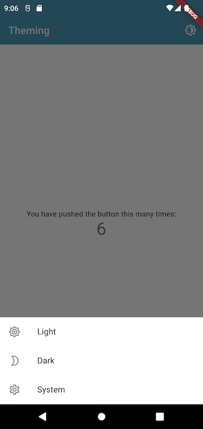
When we tap on the "brightness" icon in the app bar, we are shown a modal bottom sheet with our 3 choices. By tapping on any of the themes, we call our function which updates the value of the ValueNotifier. This causes the app to rebuild, and we can see the theme changing.
Note 1: showModalBottomSheet can always also return null, for example when the user taps outside the modal or presses the back button. If it does, we don't do anything.
Note 2: We use SafeArea to wrap the body of the modal. This avoids intrusions by the operating system. For example, since this is a bottom sheet, a phone's notch could be hiding its contents, but wrapping the bottom sheet in a SafeArea widget will give it sufficient padding to avoid this (but only if there is a notch!).

Switching between light, dark, and true black mode
Now, to support a fourth option, true black mode, we can't keep using ThemeMode. Let's introduce a new ThemeOption enum.
enum ThemeOption { light, dark, system, trueBlack }

extension ThemeOptionUtils on ThemeOption {
  ThemeMode get themeMode {
    switch (this) {
      case ThemeOption.light:
        return ThemeMode.light;
      case ThemeOption.dark:
      case ThemeOption.trueBlack:
        return ThemeMode.dark;
      case ThemeOption.system:
        return ThemeMode.system;
    }
  }
}
ThemeOption.trueBlack will still map to ThemeMode.dark, but we'll get to this in a bit.
Let's also extract all the themes to a separate class, just to keep things simpler.
// app_theme.dart
class AppTheme {
  static const _scheme = FlexScheme.hippieBlue;

  static final light = FlexThemeData.light(scheme: _scheme);
  static final dark = FlexThemeData.dark(scheme: _scheme);
  static final trueBlack =
      FlexThemeData.dark(scheme: _scheme, darkIsTrueBlack: true);
}
Now, all that's left is to simply switch our value notifier from ThemeMode to ThemeOption. This is quite an easy change so I won't share the whole code as it's identical to the snippets share previously, but you can check the source code out on GitHub.
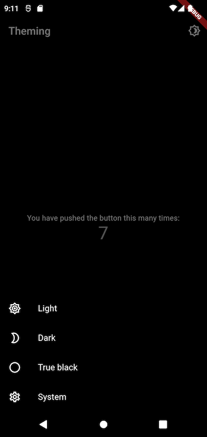
The only additional changes were the extra "true black" option in the theme picker, as well as the way the theme in MaterialApp is determined.
// _MyHomePageState#_showThemePicker
...
ListTile(
  title: const Text('True black'),
  leading: const Icon(Icons.brightness_1_outlined),
  onTap: () {
    Navigator.pop(context, ThemeOption.trueBlack);
  },
),
...
// MyApp
@override
Widget build(BuildContext context) {
  return ValueListenableBuilder<ThemeOption>(
    valueListenable: _themeNotifier,
    child: MyHomePage(onThemeUpdate: onThemeUpdate),
    builder: (context, themeOption, child) {
      return MaterialApp(
        title: 'Theming Tutorial',
        theme: AppTheme.light,
        darkTheme: themeOption == ThemeOption.trueBlack
            ? AppTheme.trueBlack
            : AppTheme.dark,
        themeMode: themeOption.themeMode,
        home: child,
      );
    },
  );
}
Very similar to what we had before, except now that the value listenable's value is of type ThemeOption, we need to map the option to ThemeMode to pass it as a MaterialApp argument. And the main change, to support true black mode, is to check whether the option is trueBlack, and if it is, use the appropriate darkTheme. And that's it! We can now choose between 4 different options.

Wrapping up
In this tutorial, we showed how to easily enable true black mode in a Flutter app with the flex_color_scheme package.
We also showed how to support both dark and true black modes (in addition to light mode, of course!) in the same app.
You can find the full source code here.
I am typically against introducing a new dependency just to introduce a small new feature. However, there is much more to flex_color_scheme than true black mode! I encourage you to take a look at the example, and dig deeper into the package.
If you found this helpful and would like to be notified of any future tutorials, please sign up with your email below.


